Branding and Identity
Effective branding aims to build recognition, trust, loyalty, and emotional connection with customers, ultimatley facilitating
long-term relationships.
A strong brand identity also enables brand extensions and diversification, which contributes to long-term success and growth within the market.
When a company undergoes a poorly executed rebrand, it risks damaging its reputation and relationships with customers. This can result in a loss of trust, as consumers grapple with confusion and struggle to recognize the company they once knew.
To mitigate these risks, careful planning, effective communication, and a gradual implementation approach are essential for a successful rebranding effort.
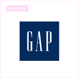
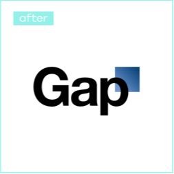
The new logo, unveiled in October 2010, featured the word "Gap" in bold black letters against a white background, accompanied by a gradient blue square. Laird and Partners Creative Agency of New York developed this design, with the rebranding effort costing the company $100 million.
GAP's clothing line had always been known for its convenience, good quality, and affordable prices, rather than being super trendy. The old logo, in use since 1990, perfectly reflected these qualities and had become iconic over the years.
Image Comparison
___________
However, the introduction of the new logo was met with criticism from the company's consumers. Over 2,000 negative comments flooded GAP's Facebook page, and a Twitter account dedicated to protesting the rebranding effort garnered nearly 5,000 followers.
The rebranding effort was limited exclusively to altering the logo, without any introduction of new clothing lines or modifications to in-store or online shopping experiences.
The brand name was depicted in Helvetica, a font considered outdated by 2010 and widely utilized by various companies, including GAP's main competitor, American Apparel.
This lack of distinction further diminished the significance of the logo change and failed to set GAP apart from its competitors.
The packaging underwent significant changes, with designers eliminating the orange and straw imagery and replacing it with a prominent clear glass filled with juice. The logo was repositioned vertically. Additionally, the distinctive "No pulp" inscription was removed, which had previously highlighted the product's unique characteristics. Instead, the new packaging prominently featured the message "100% Orange Pure and Natural." The design was crafted by the Arnell Advertising Agency based in the USA.
Image Comparison
___________
The rebranding effort incurred a £35 million expense for Tropicana. Shortly after its launch, consumers began to express criticism of the new design, deeming it "unappealing" and "unwise." Many remarked that Tropicana's premium juice now bore a resemblance to "an everyday discounted item found in budget supermarkets." Two months later, the company experienced a substantial 20% decline in sales, resulting in a £30 million loss for Tropicana.
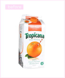
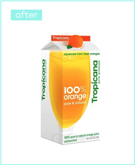
The large glass image on the packaging, while visually appealing at an angle, proved impractical on supermarket shelves where only the front side is visible, causing confusion among customers.
The vertical Tropicana logo and the "100% orange juice" label led to further uncertainty among consumers, who questioned the authenticity of the product they had previously trusted.
Consistency is Key: Maintain uniformity in branding across all platforms, spanning from your website and social media to business cards and promotional materials, fostering brand recognition.
Tell Your Story: Leverage your brand to narrate a compelling story about your photographic journey, passion, and distinct approach, forging a personal connection with clients.
Quality Portfolio: Your portfolio serves as a cornerstone of your brand. Ensure it showcases your finest work, representing the style you aim to be recognized for.
Inconsistency: Discrepancies in branding can confuse potential clients. Ensure alignment of your logo, color palette, and messaging across all channels.
Ignoring Online Presence: In today's digital era, a photographer's online presence holds significance. Neglecting your website or social media presence may limit your brand's reach and influence.
Overcomplicating: Keep your brand straightforward and focused. Overcomplicating your logo or brand message risks diluting your identity, making it challenging for clients to recall you.
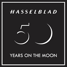
With a legacy spanning over seven decades, Hasselblad remains synonymous with uncompromising quality, precision craftsmanship, and a relentless pursuit of excellence in the world of professional photography.
HasselBlad Brand Values
Innovation
Hasselblad has a history of innovation, having played a significant role in space exploration by providing cameras for NASA's Apollo missions. This commitment to cutting-edge technology and innovation is often highlighted in the brand's identity.
Heritage
With a history dating back to 1941, Hasselblad has a rich heritage in the world of photography. The brand values its legacy and heritage, drawing inspiration from its iconic cameras of the past while continuously innovating for the future.
Professionalism
Targeting professional photographers and maintaining a reputation for delivering tools that meet the demands of the photography industry.
Quality Craftsmanship
Hasselblad cameras are synonymous with exceptional build quality and craftsmanship. The brand is committed to using the finest materials and manufacturing processes to ensure durability and reliability in every product they produce.
The brand's strong heritage in medium-format cameras and its association with precision engineering and craftsmanship are evident in the design and build quality of its products. Hasselblad's commitment to innovation is showcased not only through its historic contributions to space exploration but also through its continuous development of cutting-edge camera technology.
Furthermore, Hasselblad's positioning as a brand catering to professional photographers aligns with its emphasis on quality and professionalism. Its products are tailored to meet the demanding requirements of professionals, offering superior image quality and performance.
Overall, Hasselblad's brand identity appears to be well-aligned with its values, with a consistent emphasis on quality, innovation, and professionalism. I will aim to use Hasselblad as a strong influence on my own branding decisions as a photographer/photography business. their key values, such as professionalism and Innovation, are values I would like to carry over into my own brand identity.

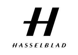
Typography: The Hasselblad logo typically features the brand name "Hasselblad" rendered in a distinctive and elegant typeface. The choice of typography is crucial in conveying a sense of refinement and professionalism, aligning with the brand's commitment to producing high-quality photographic equipment.
Symbolism: In some versions of the logo, there might be subtle design elements or symbols that reflect the company's association with photography and precision engineering. These elements could include subtle graphical elements that reinforce the brand's identity and values.
Colour Palette: The colour scheme used in the logo is carefully chosen to evoke a sense of sophistication and reliability. Traditional colours associated with Hasselblad's logo include combinations that convey a premium and professional image.
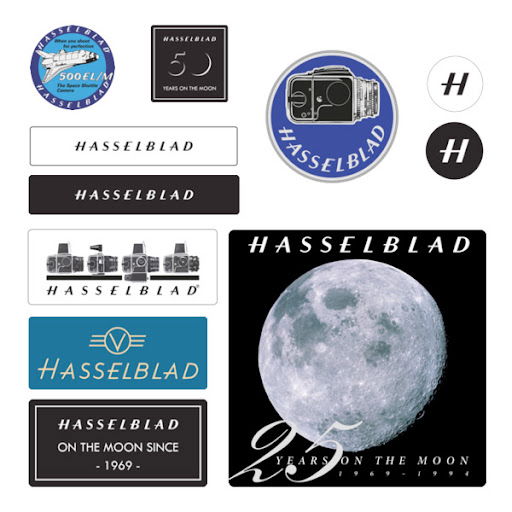
Hasselblad Logos
My brand values include: Professionalism, Modernism, Efficiency, Quality, and Authenticity.
I will aim to represent these values within my logo and my logo designing process will be based around displaying and representing these values.
Seek Inspiration: Explore other photography logos for ideas and inspiration. Look beyond the photography industry for unique elements to incorporate.
Choose Colors Wisely: Select a color palette that aligns with your brand's personality. Classic black, white, and neutral tones often work well, with an accent color to enhance visibility.
Select Fonts: Choose fonts that complement your brand identity and ensure readability across different sizes.
Include Relevant Symbols: Incorporate symbols or icons that represent photography or your niche, adding a personal touch to set your logo apart.
Experiment with Layouts: Test different arrangements of elements for optimal visibility and recognition.
Keep it Simple: Focus on simplicity to make your logo memorable and easy to understand.
Ensure Scalability: Ensure your logo looks good across various sizes and platforms, maintaining visibility and legibility.
Gather Feedback: Seek feedback from peers or professionals to refine your logo further.
Refinement and Finalization: Based on feedback, refine your logo until you're satisfied with the design's versatility and adaptability.
I will experiment with relevent symbols in my work, such as cameras and lenses to represent my photogrphy.
I will alos experiment with simplicity in my logo, as this will allow it to translate across multi-media more smoothly.
This symbol is to link my logo to my work and it immediatley lets the clinet know what my business focuses on.
To create this logo I used photoshop and my graphic design skills to experiment with typography and fonts as well as merge the sybol and text within my logo together.

This gave me a clear view of how the logo will appear alongside my work, as well as getting feedback from clients and peers on how they percieve the logo.
Over time i became less happy with this log as it appeared too generic and childish. a lot of feedback on my logo was also representative of this. because of this, I intend on creating a new logo using less bold symbols and more of a simplistic focus.
This fits the simple design I wanted and also would be easier to translate across different medias.
To create a Logo that represented m, I experimented with different typography styles and fonts based around the logo i had chosen.
My Logo Experiments
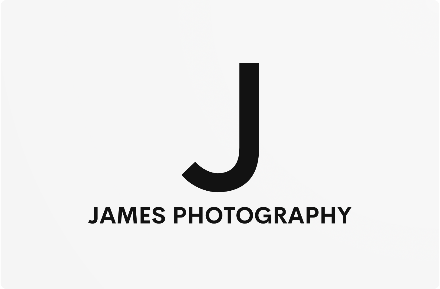


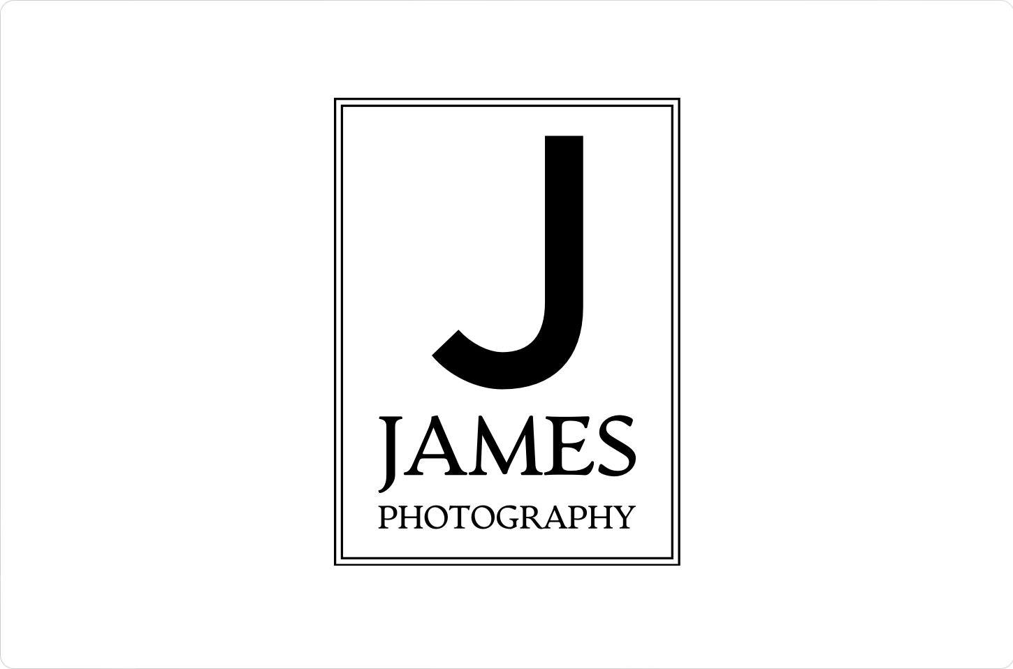
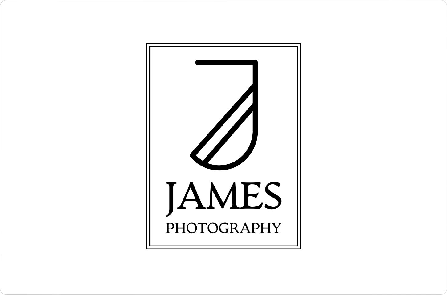
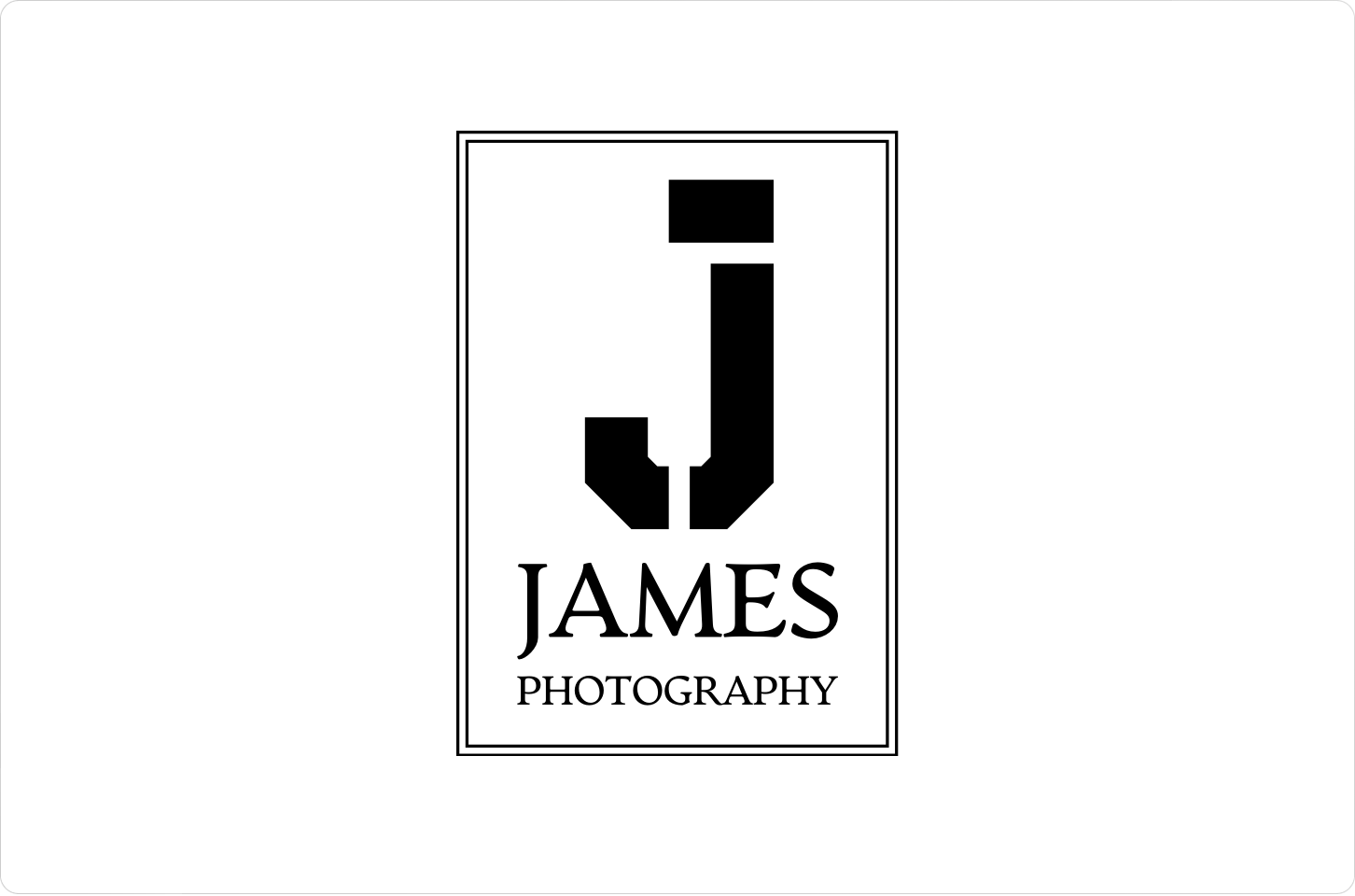
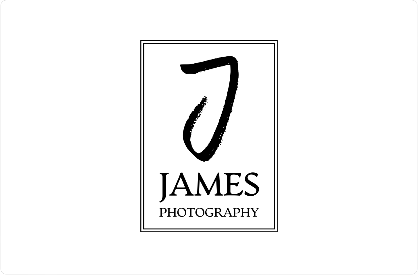
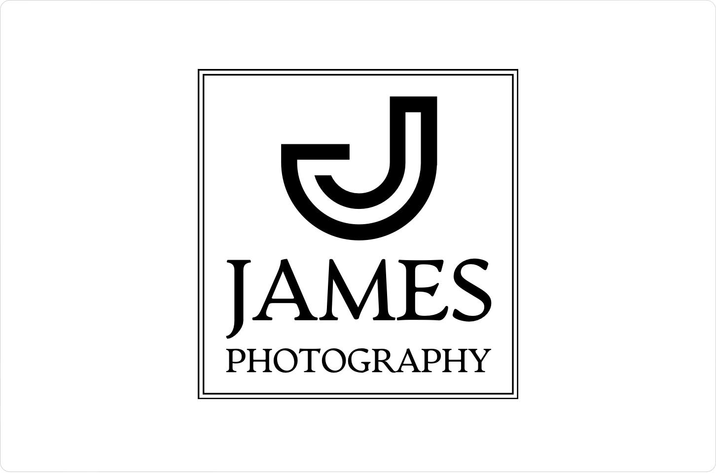
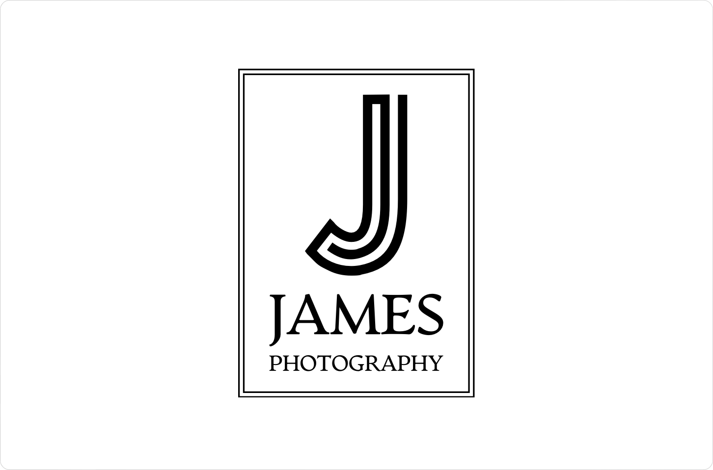
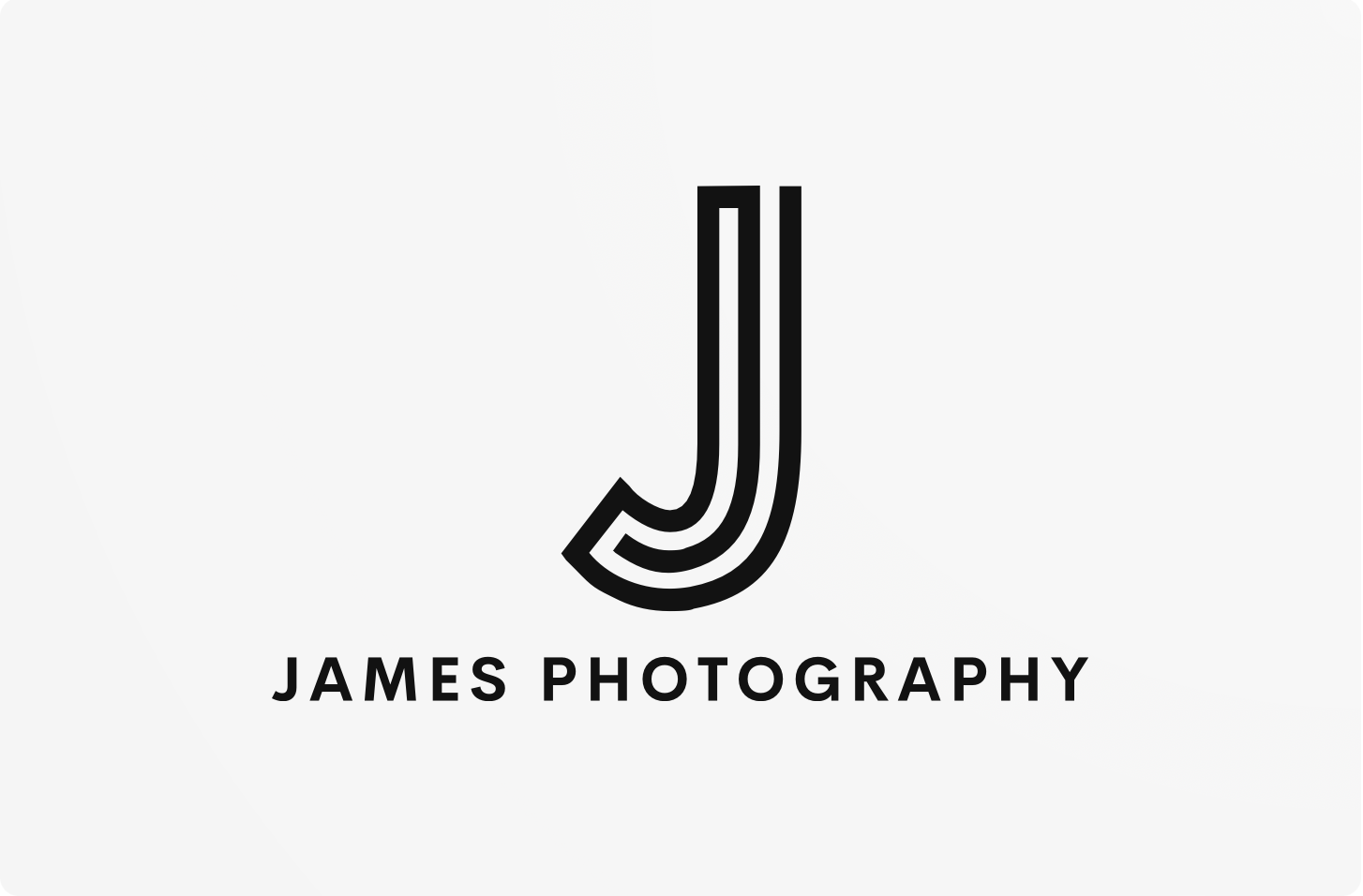
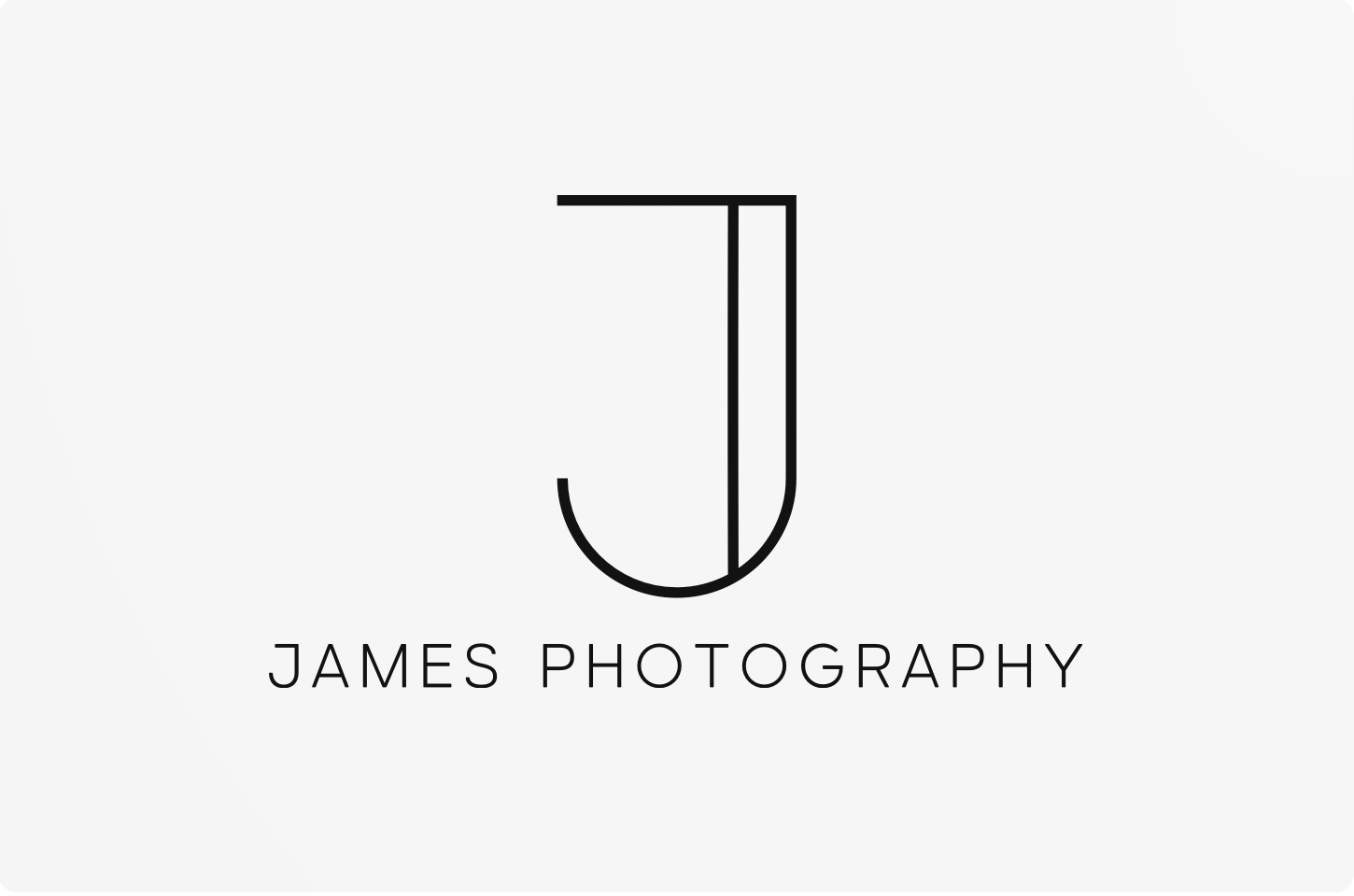
I chose this logo design because the typography of the J, which I think looks professional and modern. these are two key elements of my business that I would like to display within my logo.
This logo would also be very easy to translate to different medias because of its simple design. for example: the J can stand alone as a logo without the bottom text, which is useful for social media logos, Business cards, etc.
My newly designed website would be inspired from my Logo with its simple and clean design. this pairing allows my logo to be the prime example of my brand and represent the brand values I would like to respresent.
Going forward with my business and branding, I will continue to update my logos inline with my brand values as my business develops, changes, and evolves over time.
Designing my logo gave me a visual. representation of my brand and allowed me to make changes based on the values I wanted to respresent and the logo style I felt best represented these values.
Overall, I think my simplistic logo effectively communicates my brand's identity and resonates with my audience, ensuring a strong visual presence in a competitive market. The research into other brands was vital in aiding my own brand creation and I will continue to update and change my logo as my brand evolves and changes overtime.